
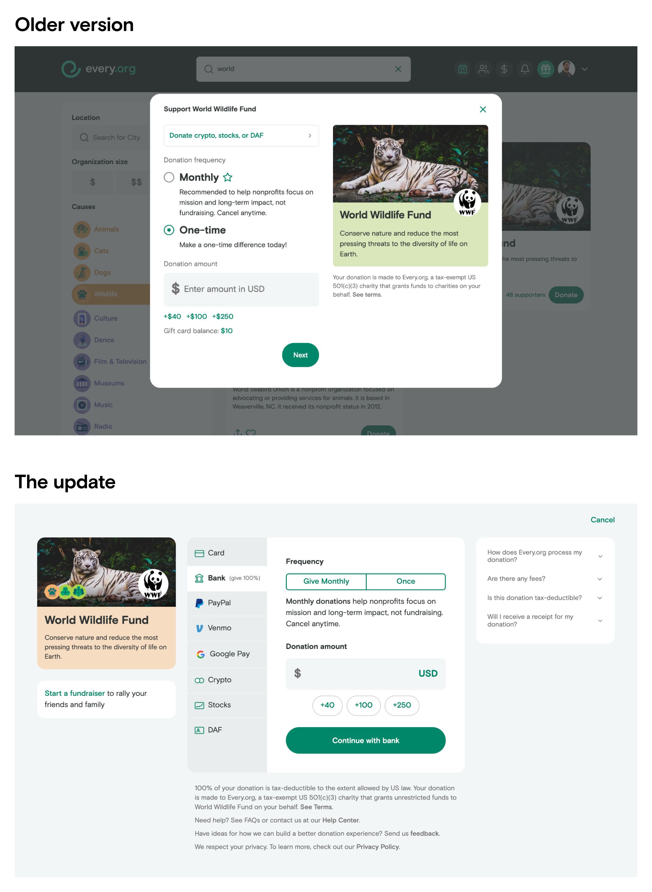
If you’ve made a donation on Every.org recently you might have noticed some big changes to the donation flow. This has been a couple of months in the making and represents a lot of research, design, and engineering. We’re pretty excited about the changes and wanted to share a little more about what’s new, including better designs leading to 29.5% higher donation conversion, and the ability to add optional tips to support Every.org's work and longterm sustainability.
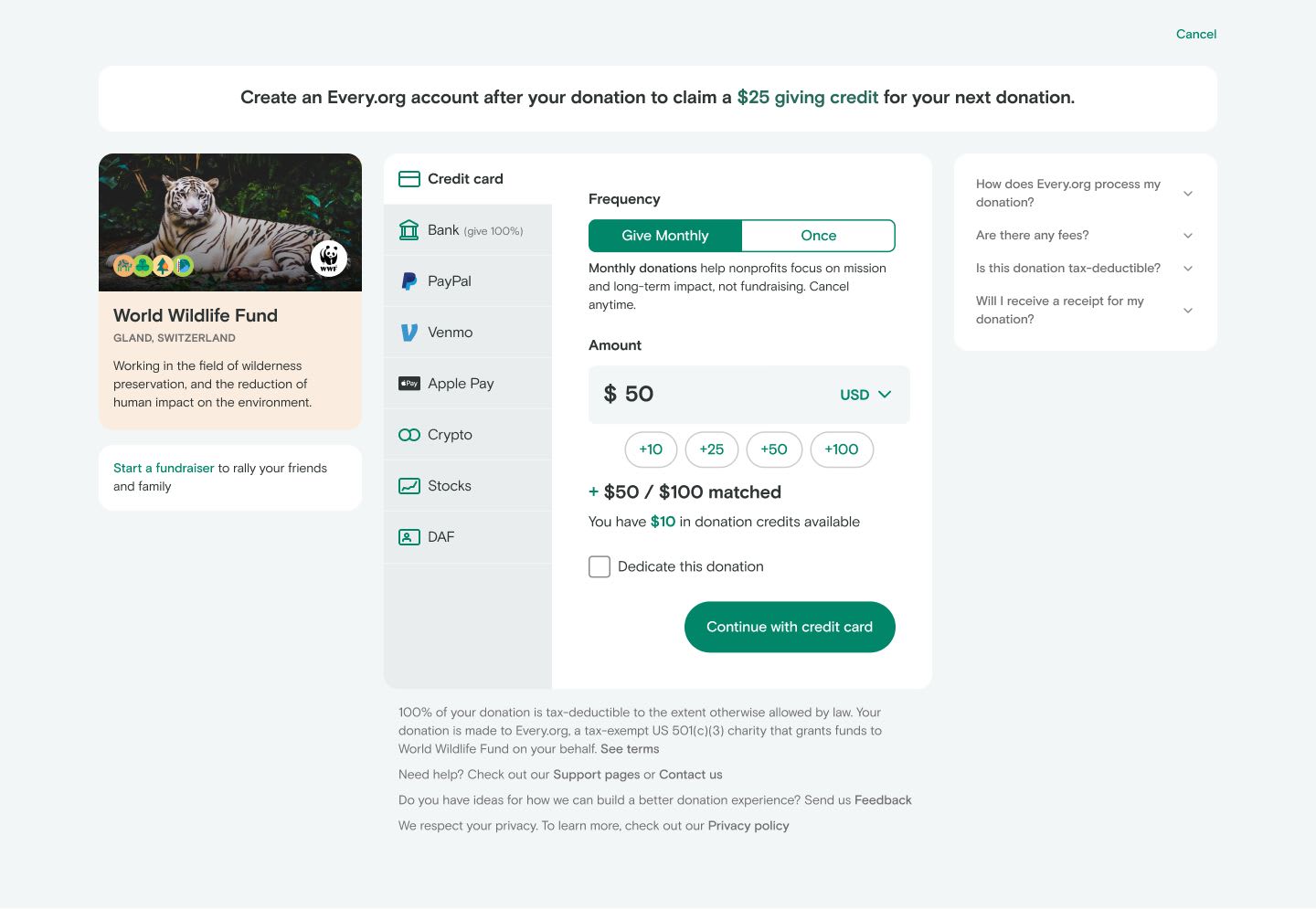
Putting payment methods front and center
Every.org’s diversity of donation methods has become one of our core values for donors and nonprofits. From fee-free bank connections to Venmo to cryptocurrencies and stock transfers, we offer more ways to give than any other donation portal. Unfortunately, most donors didn’t find out about all of these options until getting several steps into the donation process. What’s more, some donors missed the crypto, stock, and DAF options altogether.
Our new flow puts the diversity of options front and center in the very first step. By default, donors start with the most common (or most recently used by them) option already selected so they can donate as quickly as possible. But we’ve made it clear they have other options. We used Usertesting.com to run dozens of recorded tests with users across the country and we were pleased to hear them comment on the options. (Many thanks to the folks at Usertesting.com for gifting their awesome testing services to support our mission of a more generous world.)
Providing quick answers to donors questions
Another big update was the addition of an FAQ section. Every.org is a pretty unique organization launched in 2020 so not every donor is familiar with the role we play or how donating on our site works. We wanted donors to feel as secure and comfortable as they could while donating, so we put answers to the four most common questions right into the donation interface.
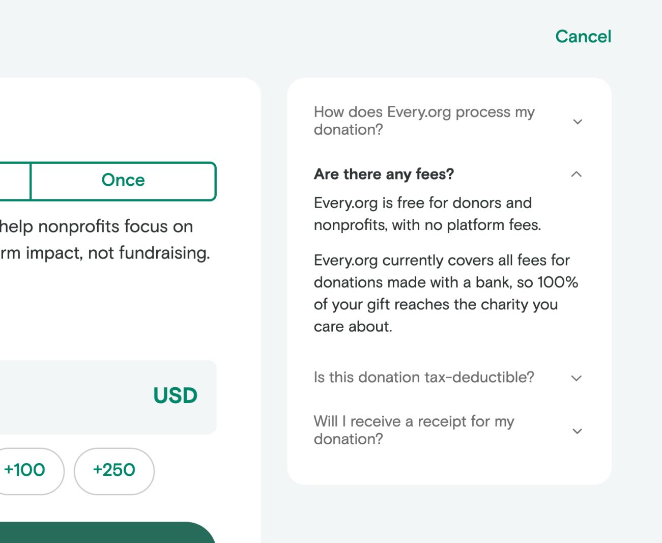
During the testing phase of the development process we were really happy to see this section was getting a lot of interaction. We use a service called Hotjar to collect data on how donors and nonprofits interact with our site. Some of their most helpful features are anonymized heatmaps and user recordings (images and videos detailing how people interact with each page). We can see folks clicking through the site and have regularly watched new donors exploring the FAQ sidebar right before completing their donation. This was valuable information suggesting the sidebar had the info donors needed to develop trust with Every.org and complete their donation. (We want to give Hotjar a shoutout for donating their services to Every.org)
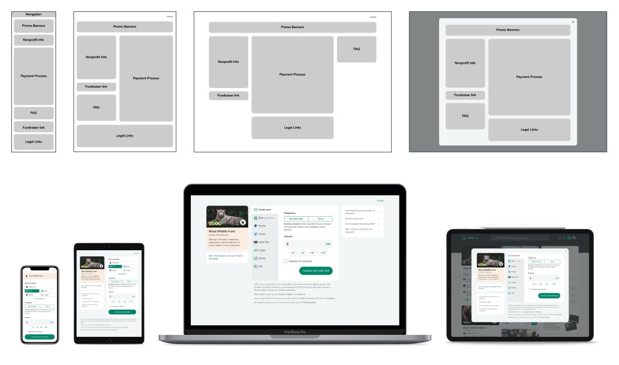
Building a flexible, modular layout
One of the advantages of being a relatively small startup is that we have the flexibility to experiment and grow quickly when opportunities present themselves. However, even the most flexible companies can be held back by inflexible designs. It’s hard to keep adding new features to a rigid layout that doesn’t have a lot of room.
Everything for our old donation flow had to be contained in a small popup window. Half of that window had info about the nonprofit, leaving only the other half for all the fields, buttons, and information about the donation.
Our new design takes a more modular approach. We divided the layout into frames which can be more easily resized or shuffled around, making it much easier to add new sections or rearrange the layout. It’s also far more responsive to different screens and devices. Desktops, tablets, and mobile devices can all have their own layouts just by shifting around the different modules.
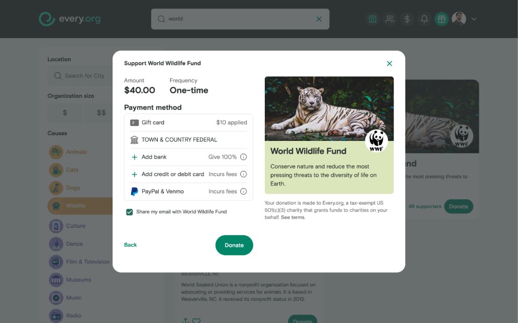
Adding tipping for sustainability
Speaking of adding new features, we’re already testing a few new updates to the donation flow. The first is an option for donors to add an extra small donation to Every.org. We know donors appreciate that we don’t take a cut of their donation. That means more money goes to the nonprofit (100% in fact if they donate through their bank account). But building and maintaining all this free donation infrastructure takes time and money. Every.org is a nonprofit supported in part by donations from folks who value the work we do. This new feature gives donors a chance to support that work alongside their main donation so we can focus more on building a better giving experience and less on our own fundraising.
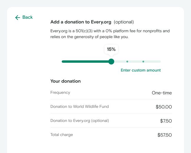
Before launching this feature for all donors we ran an A/B test. This let us make a direct comparison of the two options so we could be sure it was working as intended and not affecting the number of donations going to the nonprofits we serve. The results of the testing were good. Donors added a few extra dollars to their donations to support our work, and weren't any less likely to keep making donations to other nonprofits on Every.org. We've now launched tipping for all donors.
As the year progresses we’ll be working with nonprofits and donors to keep developing and refining the donation process.